SafetyCulture
ClientSafetyCulture
Year2021
Deliverables
Logo RevealLogo LoadingIcon Morphing
Logo animation reveals and loading I created for SafetyCulture in 2021.
SafetyCulture is a mobile-first workplace operations platform that empowers teams to enhance safety, streamline processes, and drive continuous improvement through digitized tools and real-time insights.
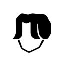
I designed two options: - Option 1 (Simple): Built from the logo’s symbol structure - Option 2 (Complex): Use check marks to reflect their focus on safety and getting things done.They went with the simple version, which is also used for iAuditor.
Fun fact: this was back in 2021 before their logo got a sleek redesign.
___
Which option do you prefer - simple or complex?
Final animation when applied to color versions and sub-brand.
If you’re interested and have a project where I can boost your logo/product/design with my animation.
Related Projects

Loading form...